|
TTASDataGrid |

  
|
|
TTASDataGrid |
|
This may be the most important object available. This will display a list of records or array field values on the form in a certain order in columns. You can allow the user to delete rows (records or array elements), insert rows (array elements only), add new rows to the end of the grid, and, through the use of the DATA_GRID command, add columns, remove columns, shift them around, etc.
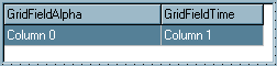
PALETTE ICON & EXAMPLE
PROPERTIES
The following are the properties that apply to this object. Some are defined in Common Properties and are linked to their appropriate page.
Appearance
Behavior
Font
Hint
Misc
Other
AltColorRows If this is checked the the grid will use the Column Color using that color and reduce every other row by 5%. If Row 1 is white the next is a darker white. giving you a nice looking effect. Remember this Uses the Column Color. Note: We may in toe future add the ability to choose the color. This property is checked by default. this feature available at ver. 7.7.2
Here is an example using the AltColorRows notice the color change between Rows
| AutoNumAlign | If this is checked (set to .True.) numeric columns will be aligned to the right, automatically. |
| ColCount | The number of columns in the grid. This is generally maintained automatically by the number of columns you create in the Columns property. |
| Columns | This is where you created or edit the columns for this grid. See the Data Grid Columns Editor for more information on creating columns. The actual column objects are defined in TTASDGItem. |
| DefaultColWidth | When a column is created this is the default width in pixels that will be used. You can adjust any column to any width you wish. |
| DefaultRowHeight | The height of each row in the grid, in pixels. When the grid is used to access a regular file this value may be modified to force the rows to show up properly within the space available in the grid. |
| EnhRowColMove | If you are using the grid to edit array fields and you want to allow the user to move rows, or you want to allow the user to move columns for either type, then check this property (set to .True.). |
| ExtraFields | This is used in connection with WLISTM grids. When the user inserts or deletes a row you will want all the arrays that apply to be updated. Some of the fields in those arrays may not be part of the grid. To make sure all fields are updated properly add those field names using the editor for this property. This is not a field that can be entered directly or at runtime. For more information please see TTASDGExtraFld. |
| FixedColor | The color used for fixed columns or rows. |
| FixedCols | The number of fixed columns. These are columns which can't be used for data entry. Generally this value is 0. However, if you are using the grid to edit array fields you can set this value to 1. The first column will appear to be fixed to the user, however, they can, by clicking on the appropriate row, move the row to another location in the grid. |
| FixedFont | The font to be used on fixed rows and columns. Uses the standard Font Property Editor. |
| FixedRows | The number of fixed rows. These are rows which can't be used for data entry. Generally this value is 1 since the top row of the grid is used for column titles. |
| GridLineWidth | The size of the grid lines in pixels. This property value defaults to 1. |
| HintColor | The background color to use when displaying hints for the grid. |
| Hovering | If this is checked (set to .True.) and the grid is in edit mode, the cell will be selected if you move the mouse over the cell and let it stay there for a few moments. |
| Navigation | This is a multiple option property. Click the '+' next to the property name to display the sub properties. |
AdvanceAtEnd - If this is checked, when the user moves off the last cell in the last row the grid will automatically create a new row.
AdvanceAuto - If this is checked, and the cell has a masked entry, the grid will automatically move to the next cell when the entry is complete. For example, if you were entering a telephone number and used a masked entry field, when the user reaches the end of the entry the cursor will move to the next cell.
AdvanceDirection - Which cell is the next one selected when the grid is in edit mode. The options are: adLeftRight (the selected cell is the next one in the row or the first in the next row) or adTopBottom (the selected cell is the next row). The default value is adLeftRight.
AdvanceOnEnter - Move to the next cell when the user presses the ENTER key.
NOTE: If you are in goRowSelect (see below) and want to allow the user to press ENTER to select the record then check this option (set to .True.).
AllowAddRecListF - Allow the user to add a new row at the end of the grid when a file is attached to the grid. If this is not checked the user won't be able to add new records (rows) to the file.
AllowDeleteRow - If this is checked the user will be able to delete rows (records) from the grid by pressing the DELETE key.
AllowInsertRow - If this is checked the user will be able to insert rows in the grid by pressing the INSERT key. This will work with arrays only.
CursorWalkEditor - If this is checked when the user moves the cursor within a cell using the left or right arrow key and reaches the end of the entry field for that cell, the cursor will move to the previous (left arrow) or next (right arrow) cell.
InsertPosition - If you've checked the AllowInsertRow property, and you're working with array fields, this determines where inserted rows will be placed. The options are: pInsertBefore (add a new row before the current row - the default value) or pInsertAfter (add a new row after the current row).
NOTE: All of the above options apply ONLY IF the grid is in edit mode. See goEditing in Options below for more information.
| Options | This is a multiple option property. Click the '+' next to the property name to display the subproperties. |
goColMoving - Allow the user to move columns in the grid. This can also be done programmatically through the DATA_GRID command.
goColSizing - The user can resize individual columns.
goDrawFocusSelected - if you don't check this value, and goRowSelect is checked, you will notice that the first column in the row is a different color than the rest of the row. It is recommended that you should always check this option if you have also checked goRowSelect.
goEditing - If this is checked the grid is placed in edit mode. The goRowSelect option will automatically be unchecked.
goFixedHorzLine - Horizontal lines separate the fixed columns and rows. The default value is checked.
goFixedVertLine - Vertical lines separate the fixed columns and rows. The default value is checked.
goHorzLine - Horizontal Lines separate the rows in the grid. The default value is checked.
goRowMoving - Allow the user to move rows in the grid. This only applies to grids that are used in conjunction with arrays. Also, you the FixedCols property value must be at least 1. The user then grabs the row by the fixed column portion and moves it to the new location. The array location will be updated automatically.
goRowSelect - If you want the user to select a record (or array element) instead of editing individual fields then check this option. This would be used for choosing a record during lookups, etc.
goRowSizing - The user can resize individual rows.
goVertLine - Vertical lines separate the columns in the grid. The default value is checked.
| PasswordChar | This is the character to use when the column is marked as Password type (see TTASDGItem). |
| RowCount | The number of rows in the grid. This is set automatically by the program, however, if you want to see how many rows will fit in the space you have designed you can put a number in here. It will not have any effect once the program is running. |
| ScrollBars | This property allows you to determine whether or which scroll bars should be displayed if they are necessary. The default value is ssBoth (both vertical and horizontal scroll bars can be displayed). It is recommended that you leave this ssBoth unless you know you don't want the user scrolling one way or the other on the grid. |
| SelectionColor | Sets the grid background color for selected cells. Default value is clHighLight. |
SelectionRectangle If this is checked (set to .True.) a thick line will be placed around the selected row or cell.
SelectionTextColor The color to use when a row is marked as selected (see Options for goRowSelect).
| VAlignment | Sets vertical alignment of text in cells in single line mode. The options are: vtaTop (display the text at the top of the cell - this is the default value), vtaCenter (center the text vertically in the cell) and vtaBottom (display the text at the bottom of the cell). In most cases this won't matter since the row size is just a little bigger than the text itself. However, if you have large rows and want to move the text to a different position you can do so here. |
Position
TAS Pro
| CurrentCol | Use this property to get or set the column number in the grid. The first column (after any fixed columns) is number 1. This property will not be visible in the object inspector. |
| CurrentRow | Use this property to get or set the row number in the grid. This should only be used for memory array type grids. In file grids the actual row may or may not match what you expect. In memory array grids the row matches the element number in the array. This property is will not be visible in the object inspector. |
| FastSearchFld | If you want to allow the user to search for a record in the grid at runtime you would place an entry object (TTASEnter, TTASNumEnter, TTASTimeEdit, TTASDateEdit or TTASComboEnter) on the form along with the appropriate grid. You would then put the object name into the FastSearchFld property. Then any characters the user enters will be used for searching the record in the grid. If they backspace, the letters will be deleted and a previous record will be found. You can use the AllowedChrs, DfltValue, EditMask or CharCase (if available) to control what the user enters or how the characters are entered. Also, if you set the ReturnIsTab option in the entry field and the AdvanceOnEnter option in the Navigation property for the grid, when the user presses the ENTER key it will have the same effect as pressing the ENTER key in the grid and the .SELECT event will fire for the grid. An example of this is the program is FLDLST. |
NOTE: If you are searching a number you need to be aware of this property. for the TTasNumEnter. FastSearchType If you are using this object as a FastSearch field in connection with a TTASDataGrid you need to specify the type of numeric field. This would match the index type you're searching on. So, if the index is a type N you would set this to fsNum. If the index is a type R, this should be fsRec. The options are fsByte (type B), fsInt (type I), fsRec (type R) and fsNum (type N). This can be changed at runtime.
NOTE: The FastSearchFld value can be changed at runtime. This means you can change the entry field to match the array index. You could have multiple fields on the form and only the appropriate field would be visible. If the user changed to a different index the appropriate field would be made visible and the current would be set to invisible. Set the FastSearchFld to the new field name and you're done.
NOTE: This only works when the grid is in goRowSelect mode as described above.
NOTE: The Up and Down Arrow keys will also work in a FastSearch field. This means the user can move up or down the grid by pressing the appropriate key when the FastSearch field has focus.
NOTE: If you are accessing a CodeBase file, then this must be a TTASEnter type field. There are a couple of different rules applying to CodeBase files also, these are:
1. When entering a date value to search on it must be entered in YYYYMMDD type format, for example, 20021005 is October 5, 2002.
2. If you are entering a compound key (made up of multiple keys) you must enter the defined display size of the field, not the actual size you're looking for. For example, if part of the index is an alpha type field that is defined as 6 characters and the index you're looking for uses only the first three as in ABC, then you would still enter ABC and three spaces before the next part of the index.
3. If you are searching on a numeric value the value must be right justified and the full display size entered. For example, if you are searching on an I type field of Dsize 3 and the value you're searching for is 45 then you must enter a space and then the 45. The same applies to numeric values with a decimal character. And, internally in CodeBase, ALL decimal characters are periods and no other separators are saved.
| NoAutoUpdate | When a grid is active, the current row will be updated each time a screen refresh is called for the parent form. This can be often depending on what's happening on the form. If you have modified data in the grid and haven't saved the record before the screen refreshes, the data changes can be lost. By setting this property to true (checked) you will keep the grid from updating that data automatically. |
| StartAtEnd | If you want to start the grid at the end of the file for the given key then check this option (set to .True.). This is effective during the initial display of the grid only (or when you execute the SETUP option in the WLISTF or WLISTM command). |
COMMENTS
Each intersection of a row and a column in the grid is called a cell.
Any changes the user makes to the grid during runtime is not saved automatically. If you wish to keep track of the changes you will need to look at each column (using the DATA_GRID command) and save the layout in a separate file (or in the registry with the REGEDIT() function).
NOTE: If you are in goRowSelect (see below) and want to allow the user to press ENTER to select the record then check this option (set to .True.).
NOTE: If you want to check ValidExpr's in your columns you must use the GRID_VALID_CHECK() function instead of the VALID_CHECK() function you would use in a normal entry field.
EVENTS
This object has events that are called depending on what the user does. The events are routines in your program that may return a value (generally .True. or .False.) or just alert your program that something is happening. An event looks to your program for a special label. It is made up of the object Name, a period (.) and the Event name (listed below). For example, the Add event below would be: ObjectName.Add:
| Add | This event is called when the user tries to add a new record to the end of the grid. If you use this event you must return .True. or .False. when you return (RET) from the routine. If you return .True. the user is allowed to add a new record/row. If you return .False. the record/row will not be added. Use this event to keep the user from creating new records/array rows until they have finished the current one, or, if they have reached a maximum. |
| Delete | This event is called when the user tries to delete a record/array row currently in the grid. If you use this event you must return .True. or .False. when you return (RET) from the routine. If you return .True. the user is allowed to delete the record/row. If you return .False. the record/row will not be deleted. |
NOTE: If you have a TTASNavigator attached to this grid and you have the ConfirmDelete property set to True (checked) the delete question will be asked of the user before the Delete event is executed.
| Display | This event is called every time a row is displayed. Use this event to find related records in a file grid. The event is called before the row is displayed so that any record found will be included with the row. |
| Insert | This event is called when the user tries to insert a new row in the grid. If you use this event you must return .True. or .False. when you return (RET) from the routine. If you return .True. the user is allowed to insert a new row. If you return .False. the row will not be added. Use this event to keep the user from creating new array rows until they have finished the current one, or, if they have reached a maximum. |
NOTE: This event applies only to WLISTM (array) type grids. You cannot insert a row in a WLISTF type grid.
| Move | This event is called every time the user moves to a different row in the grid. Use this event to find supporting records, arrays, etc. Before the event is called the appropriate record is found or the array counter is updated properly. |
| Save | This event is called when the user tries to save a record than has been added or changed in the grid. If you use this event you must return .True. or .False. when you return (RET) from the routine. If you return .True. the record will be saved. If you return .False. the record will not be saved. Use this event to keep the user from updating or adding records until they are complete. |
NOTE: This event applies only to a WLISTF (file) type grid.
NOTE: If you have a TTASNavigator attached to this grid and you have the ConfirmSave property set to True (checked) the save question will be asked of the user before the Save event is executed.
| Select | This event is called every time the user double clicks on a row in the grid. This event is also called in connection with the FastSearchFld process (listed above) when the user presses the ENTER key during the search (if the appropriate properties are set correctly). |
Header This even will fire when the user click on the Header on the grid. Col1 is the name of that Column.
Example
Col1.header:
Msg 'Switch'
ret
| Note: | To control formatting of numbers in the grid use the Format command. If you need to display a number of decimal placed in the grid other then the defined number of places you can use the redef command. the number of decimal places in the O / I will not change the number of decimal places at this time. |
Note: I ran into this the other day. I had two data grids on a screen one showed the Invoice header table the next one showed the invoice history table... shared schema's. I tried to use a select and sometimes it would fail?? To get the correct record. This can not be done?? So you can make on grid active and disable the other... I place the history on a tab sheet to sperate tab sheets and used the following code...
Sample
//you may need to know what sheet # the user is looking at. Here is how to do this.
define pageindex type I
page.change:
pageindex = get_obj_prop('page','pageindex')
msg 'This is the active page # ' + pageindex
if pageindex = 5
wlistf 'dgShipment' close
wlistf ;dgSalesorder' close
wlistf 'dgsalesoder' fnum bkarinv_hndl key bkar.inv.cuscod start bkar.custcode while bkar.inv.cuscode = bkar.custcode
else_if pageindex = 6
wlistf 'dgShipment' close
wlistf ;dgSalesorder' close
wlistf 'dgshipment' fnum bkarhinv_hndl key bkar.inv.cuscod start bkar.custcode while bkar.inv.cuscode = bkar.custcode
ret
//This made my program work... I only have one active grid because of the close. Hope this helps some one one day.
See Also Data Grid Update Data Grid list File Data Grid list Memory Array WlistF WListM
Page url: http://www.cassoftware.com/tas/manual/ttasdatagrid.htm