|
TTASNumEnter |

  
|
|
TTASNumEnter |
|
Use this object to enter any numeric (N, B, I or R) type field. There are other objects to enter strings, dates and times.
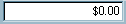
PALETTE ICON & EXAMPLE
PROPERTIES
The following are the properties that apply to this object. Some are defined in Common Properties and are linked to their appropriate page.
Appearance
| Glyph | If you have chosen a custom glyph in GlyphKind below this is where you would choose the .bmp file that would be used instead of the standard ones that come with this object. |
Behavior
Entry
Font
Hint
Misc
Other
| AutoSelect | If this property is checked (True) when the user activates this object, either by clicking on it, pressing the TAB key, or executing the FOCUS command, any Text that is currently displayed will be marked as selected. The user will be able to enter a new value just by typing. If the user wants to start at a certain character they will have to move the edit cursor to that character with the mouse or arrow keys. Default value is True. This can be changed at runtime. |
| ButtonHint | This is the hint that will be displayed to the user when they hover over the button. This can be changed at runtime. |
| ButtonWidthNum | The size of the button in pixels. Defaults to 0. This can be changed at runtime. If you want to make the button appear in the object you must set this value to something more than 0. In general, this should be 20 or 21 to properly display the button. |
| ClickKey | Choose the key stroke the user can use to have the same effect as clicking the button. This would be in addition to clicking the button. The default value is Alt+Down (alt key + down arrow). |
| DecimalPlaces | This is the number of decimal characters that are allowed for this field. This can be from 0 to 8 and should match, if it exists, the DisplayFormat property. This property can be modified at runtime. |
| DirectInput | If this is clicked (set to .True.), the user will be able to enter the text directly. If this is not clicked (set to .False.) the only way they will be able to set the text value is to click the button and have the routine that is called set the Text value. The default is checked. This can be changed during runtime. |
| DisplayFormat | This will control how the number is displayed to the user. The default value is $,0.00;-$,0.00. The effect of this is to force two decimal characters, use a comma (,) to separate thousands, etc, use a period as a decimal character, preface the field with a dollar sign and, if it's a negative number, put the minus sign in front of the dollar sign. Make sure the number of decimal characters match what you have in DecimalPlaces. If this is blank there will be no formatting. This property can be modified at runtime. |
| FormatOnEditing | Generally in Windows numeric entries the value is moved to the left (left justified) and all formatting is removed when the user makes changes. If you check this property (set to True) the number will remain right justified and the formatting will remain while the user edits the numbers. The default value is checked (True) and can be modified during runtime. |
NOTE: If you check this option you must not use the .CHANGE event also. If you do, the entry will not work properly.
| GlyphKind | This will determine what appears on the button in this object. The options are: gkCustom (this will use what ever you have chosen in the Glyph property above), gkDefault (the default value, displays a blank button), gkDropDown (a standard drop down arrow glyph), gkEllipsis (a standard ellipsis glyph). |
| MaxLength | The maximum number of characters the user can enter for this object. If you have connected this to a field in your program with the FieldName property then this will be set automatically when the program runs to the size of the field. |
| MaxValue | You can specify the maximum value that can be entered into this object by putting that value here. This is similar to using the Valid event except that you don't need any other code. The default value is 0 which means no checking. This can be changed during runtime. |
| MinValue | You can specify the minimum value that can be entered into this object by putting that value here. This is similar to using the Valid event except that you don't need any other code. The default value is 0 which means no checking. This can be changed during runtime. |
| NumGlyphs | If you have two glyphs that can be displayed, one normally, and the second when the user clicks the button, then this would be two. The default value is one. |
| Text | In this object this property is not relied upon. Instead the program uses the Value property. |
| Value | The numeric value of the entry. This strips all formatting characters and all that's left is just the actual number. |
| ZeroEmpty | If this is checked (True) and the Value property is 0 then the entry field will be blank when the user sets the focus to this object. |
Position
| AutoSize | If this property is set to True (checked) the object will increase in size if the Text value is too long to be displayed and reduced in size if the Width value is too wide for the Text. Default value is True. You should change this to False (unchecked) if you want to make sure the entry field stays the same size as you designed it. This can be changed at runtime. |
TAS Pro
| DfltValue | This value will be inserted automatically into the field if the field is blank when the object is chosen on the form. If you want to use a constant value surround the value in quotes, e.g., '100.50' etc. If you want to use a field, then just put in the field name. The default value is blank. This can be changed during runtime. |
NOTE: You can't use an expression here. However, this is a perfect use of the VALUE option in the DEFINE field command. Just define a field, set the VALUE option to what ever expression you want to use, and put that field name into the DfltValue property.
| FastSearchType | If you are using this object as a FastSearch field in connection with a TTASDataGrid you need to specify the type of numeric field. This would match the index type you're searching on. So, if the index is a type N you would set this to fsNum. If the index is a type R, this should be fsRec. The options are fsByte (type B), fsInt (type I), fsRec (type R) and fsNum (type N). This can be changed at runtime. |
| FldModified | NOTE: This is a runtime only property and will not show up in the Object Inspector. |
EVENTS
This object has events that are called depending on what the user does. The events are routines in your program that may return a value (generally .True. or .False.) or just alert your program that something is happening. An event looks to your program for a special label. It is made up of the object Name, a period (.) and the Event name (listed below). For example, the Change event below would be: ObjectName.Change:
| Change | This event is called every time the user makes a change to the Text of this object. That includes entering a new character, deleting a character, etc. Each time this event is executed the field that is attached to this object through the FieldName property is updated so that you can check the characters entered, modified, etc. through the field. Be cautious about using this since it will slow down the entry process. |
| Click | This event is called if the user clicks the button on the object. |
| Disp | This event is called when the field that is attached to the object is to be refreshed on the screen. This can happen when a record is read, after a calculation, etc. |
| Post | This event is called when the user moves from the current object to another. By default this event will return .True. If you return .False. This will keep the user from leaving this object. This will stop the process from continuing, This can be used to make sure settings are proper after leaving the object. To force the user to stay on the current object, if there is a problem, you may also use the Valid event instead of this. |
| Pre | This event is called when the user moves into an object. If you use this event you must return .True. or .False. when you return (RET) from the routine. If you return .True. the user is allowed to access the object. If you return .False. the object that was active before they got to this object will get the focus again. This keeps the user from accessing an object that you don't want to be active. Commonly used in application where some fields are accessible sometimes (RET .TRUE.) and aren't others (RET .FALSE.). |
The process by which these events are called is:
Pre - This occurs when focus changes to the object.
Change - During field entry.
Post - Called after Valid returns .True. (if there is a Valid event) and before the Pre for the next object.
Disp - Is called anytime the form/object is refreshed.
Page url: http://www.cassoftware.com/tas/manual/ttasnumenter.htm