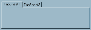
This can be used to create a standard multi-page notebook on your form. You can place objects (including another TTASPageControl) in the panel below the tabs and the objects will be seen only when the user chooses the appropriate tab.
PALETTE ICON & EXAMPLE
![]()

PROPERTIES
The following are the properties that apply to this object. Some are defined in Common Properties and are linked to their appropriate page.
Appearance
Behavior
Hint
Misc
Other
| HotTrack | If this is checked (set to .True.) the tab will highlight when the user passes the mouse over the tab. This can be modified at runtime. |
| Images | If you want to use graphic images in the tabs you need to put a TImageList object on the form and load the images in that object. Then choose that object here. In each of the TTabSheet objects you would choose the appropriate image number. |
| MutliLine | If you want to allow multiple lines of tabs then check this property. The default value is unchecked. |
| PageIndex | The index number of the active tab page. By changing this value at runtime you can force a page to be active. |
| PageName | The object name of the TTabSheet that is currently active. This can be modified at runtime. |
| RaggedRight | If there are multiple lines the tabs will, by default, grow to fill the width of the object. If you don't want that to occur then check (set to .True.) this property. This can be modified during runtime. |
| ScrollOpposite | If there are multiple lines, when the user clicks on a tab that is not in the active line, the active line will switch with that tab line. Normally, this will put the active line immediately above the object panel. However, if you check this property (set to .True.) the active line will do the reverse, it will be placed at the top of all other tab lines. |
| Style | This property controls what the tabs will look like. The default value is tsTabs, the standard tab appearance. The other options are tsButtons (use buttons instead of tabs) and tsFlatButtons (the tabs appear flat with dividers between them). |
| TabHeight | This is the height of the tab in pixels. The default value is 0 which means the object will use the size required for the font. This can be modified during runtime. |
| TabPosition | If you have specified tsTabs in Style you can choose where the tabs should appear. The options are: tpBottom (under the object panel), tpLeft (left side of panel), tpRight (right side of panel) and tpTop (the top of the panel - the default value). |
| TabWidth | This is the width of the tab in pixels. The default value is 0 which means the object will use the size required for the font and the length of the text. This can be modified during runtime. |
Position
EVENTS
This object has a single event that is called if your user changes from one tab to another. This event looks to your program for a special label. It is made up of the object Name, a period (.) and the Event name (Change). The full event name would be ObjectName.Change:. You would not return a value from the program, just a simple RET is all that is required. So, the user clicks the page tab, if the event label exists the routine is called, you can check what the new active page is. If you don't want the user to access that page all you have to do is set the PageIndex or PageName property. You return from the routine, and the user has control again.
Example
//This code below in a post event
// this set the page to display in the TTASPageControl and set focus to a tas enter object.
myevent.click: or myevent.post:
set_object 'page' property 'tabindex' value 0
set_focus 'compname'
ret
To use the change event in the TTASPageControl
ObjectName.Change:
// Do something
ret
//you may need to know what sheet # the user is looking at. Here is how to do this.
define pageindex type I
ObjectName.Change:
pageindex = get_obj_prop('page','pageindex')
msg 'This is the active page # ' + pageindex
ret
Page url: http://www.cassoftware.com/tas/manual/ttaspagecontrol.htm